Thursday, 19 May 2011

Speaking from experience; final booklets and facebook page.


For my final piece I designed my three booklets each containing different information that is relevant to being a first year on the graphic design course. I feel overall that my final pieces are successful because they are simplistic and get my idea across with no confusion. Each book has it's own bellyband to indicate what it is and then I made a final larger one for the set of books as a student would receive them together. I think the fact they are pocket size works really successfully because then they can be kept in a students wallet or even just in their pocket. I've used the fact my topic was money to my advantage because the books look like a pile of money when they are together (as seen above). 

This was the facebook page I created so people could go and post their own tips and experiences. I added everyone in the current graphic design first year as there comments were likely to be more relevant  with the project being based around the course. This wasn't as successful as it possibly could have been because only one person commented on the page. I do feel that if this was left longer more people may contribute and the concept itself was pretty clear. I also think that it may have been more successful if I got others to spread the word. 


Lorenzo's type and grid workshop.


Cheaper magazine.


High end magazine. 


For this task we had to take two similar magazine articles out of a high end magazine and also a cheaper one, so I chose to base mine on celebrities. We then had to create new layouts for only one of the articles and there had to be the safe 'high end' layouts and the more crazy experimental looking ones. I started off with the Katy Perry article but felt that the content of this was not suitable for a double page spread as in the magazine it was across three pages. I then moved onto the J-Lo article because the content was better to work with over two pages. In my layouts I tried to create the hierarchy of elements by using colour and bolder pens, so the orange areas would be a question. Overall I feel that my 'crazy' layouts weren't as experimental as they could have been because I generally like things neat and tidy so automatically stuck to this style. I also feel that I could have made the style of text I planned on using a bit more obvious to add to the hierarchy and also give a better idea of what I was trying to achieve. When I started doing the layouts I was using a three column grid but then it was suggested I try a larger number of columns, this did help me experiment more in a sense. I can take what i've learnt from this and in corporate it into my indesign layout that i'm currently working on as I feel that at the moment it's looking a bit bland and could use some of the techniques i've learnt here. 

This was the grid I used. 

John's workshop; 'lovin Leeds'.

This brief was set to get us thinking outside the box a little bit and to give us a break from our usual practice. There didn't have to be a final idea, it was mainly considering the concept and thinking BIG. We were split into groups and asked to come up with an event that could be held in Leeds in the summer of 2012. The inspiration for this event was things like Woodstock, social interaction and harmony. 

We started to consider some sort of festival we could create other than the usual music festivals. The idea then came about that food brings people together so why not create a food festival. As soon as we had this idea it was onward and upward. We decided the festival would be multi-cultural and could come about in the form of a street party. We wanted this to be an opportunity for different cultures to come together as this would give everyone the chance to try things they maybe haven't before. It also meant there would be something for everyone as people are vegetarian or don't eat meat etc. for religious reasons. We then began to consider countries that could be included in the festival so that there was a broad range of food. We also came up with the idea that famous chefs from the countries could do cooking demonstrations.  


We each chose two countries to go away and research so we could become more familiar with the type of things they like to eat and their beliefs. In particular we chose to look at a brief history of each country  where food is concerned, if they had an famous chefs at all that we could include in our festival and a few recipes. 

We were told to consider the bigger idea rather than little details so we thought it was essential to come up with a name for the festival. Initially we came up with 'Meet Feast' and a tag line 'Make food not ward'. This was based on both the fact that food brings people together and also our festival was going to be a place you could go and meet new people whilst consuming food. A few people in the group however, got amusement out of this name so we decided it would be best to change it. We then came up with the name 'FUD' which was short, snappy and straight to the point...meaning food! We also came up with a date for the event but then we were reminded that the small details are not important with this brief. 

After a brief discussion with john at the end of the first session he told us to consider;
1. The idea
2. The story
3. The event 
4. The look and feel
5. Will the event be amazing?
Our group also decided that each of us would go away and design various different elements of the festival as promotional material that would make people want to attend. 

I decided to create some 'teaser' poster design ideas so that people would want to know more about this festival. My colour scheme somehow ended up being red, green and blue but these work quite well together and the ideas are simplistic. I used the fact the 'U' can be turned into a smiley face to make the whole idea seem more inviting and happy. This also created quite a good idea for a logo. 

On the second session with John we created some design boards ready to present our idea to the rest of the groups. Myself and Alex looked at ways in which we could advertise our event... THE BIGGER THE BETTER! we came up with some really wacky ideas but this didn't matter because when we began this task we'd been told we had no budget at all. I also added my poster designs to this board so that it looked a bit more interesting and people could understand the sort of feel we were going for. Max was coming up with little incentives and one of those happened to be receiving a free helicopter, we all though this was completely ridiculous but then John liked the idea because this was 'thinking big'. 

Overall our festival would be lively, happy and tasty! We'd hope that people from all over would visit Leeds to join in and as Leeds is quite multi cultural anyway we feel it would be pretty successful. It would line the streets of Leeds so people wouldn't be able to miss it and its an easy location to access. We even considered giant versions of foods that could be shared just to make it more exciting. At the end of the day everyone loves food so this would be a great festival!

I feel i've got a lot from doing this task because its made me think more about exploring outside my comfort zone because nowadays things you think are impossible actually aren't. It was also really good to concentrate on the content of an idea rather than the final outcome because it meant anything was possible and you could let your imagination run wild. 

Tuesday, 10 May 2011

Speaking from experience development.

After i'd come up with the content for my book I did a few quick sketches of layouts that I could put my content into. Straight away I seemed to have an idea of how I would like my book to look and thought i'd get more from actually creating it and testing prints so moved away from drawing layouts. I also experimented with different fonts for the belly band I want to create to go around the booklet because I felt the creatively should stand out to emphasise the idea. Here i've also started doing some illustrations that fit with my content to add to the book. 


Once i'd got a basic layout together I tested this on various different stock so I could get an idea of which it would look best on and also which wasn't too thick when it was folded into a booklet. The blue and yellow card didn't really work because the colour in the images changed and it washed the text out in a way with it being so small. This is the stage I was at when I took my work to the second crit, I felt there was enough work to get relevant feedback and it was a good point to be at if drastic changes were needed. 

I also tested my booklet on a larger scale to see if this would look any better but I felt the fact the other booklet was pocket sized still worked so much better as an idea. I also began to look at adding a border to the booklet design because as it stands it looks quite plain. 
After the second crit it was suggested that I create a second book so that I can have 'in and around university' and 'out of university' so people are aware of how to survive financially in both situations. So above I came up with the content for my second book and feels this one links the whole concept to the course more as it talks about the mac suites and the print room which are important factors of the course. I also decided to create a third book full of essentials because two didn't seem enough for a set and essentials are an important factor too so people know what they need both physically and in personality. 

Another thing that was pointed out in the crit was the fact the 'creatively' on the belly band was illegible so this had to be changed too, I experimented with a few more fonts and styles until I found one I was happy with. I've also created more imagery for my other two books so they have the same style as the first one.  

One of the comments given in the crit was the fact the text was maybe a little too small and quite hard to read so I printed a section of one of the booklets to compare how the difference in size looked. I felt it looks better larger as there was the space for this and its also easier to read.

These are the two new font styles I chose for my belly bands and it was clear that one worked better than the other. The top font works better because its easier to read and quite simplistic. The variation in letters makes the whole thing look a bit more interesting and 'creative'. 


Indesign development.

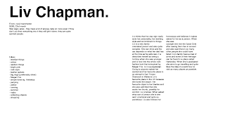
To start with a created a grid so I knew exactly where I was going to place things and this was also something i'd learnt in a visual language session with Lorenzo. I worked on the text first as I felt this was most important and once I knew where this was going I could place in my images. I did quite a few layouts trying to get the placing of my text correct. 


Here i've shown initially where I thought my images would go (the crossed boxes) as I though at the time I was satisfied with this layout. 


I didn't like this at all because the text on the right hand side just didn't sit right as the whole thing was out of balance. 


I was really happy with this layout, I though where I've placed all the text works really well and doesnt look out of proportion. I could then move on to experimenting with colour.


In Liv's interview she said that she liked the whole rock chick style so I felt that pink and black where suitable, as well as pink being one of her favourite colours. 


However pink on its own seemed to work a lot better and looked neater. 
Although the pink background looked quite good I felt it was way too overpowering and due to there being such a big block of colour the white text got a bit lost in it. 


Instead I put a block of pink behind the text to emphasise the fact the article was about Liv Chapman. 


This is the final layout for text and colour that I was pretty happy with because it look sophisticated. I stuck with a san serif font (helvetica) as Liv had told me she likes this font and it seemed to be working. 

My illustrations were hand drawn and I drew them on to a copy of the layout so I could see exactly how it would look and know I was happy with it. My illustrations are quite random as Liv stated this as a personality trait. 

I took all my hand drawn images into photoshop to digitise them and then added them to my layout where i'd placed them on the hand drawn copy. At this stage we had a mini crit in groups, in one of Lorenzo's type and grid sessions, my comments were mainly related to typo's and the fact that the section of 'likes' could be moved across as well as the title, as they get too lost in the border. 

This is the final layout for my indesign project. I feel its successful because theres balance on either side and the page looks full and exciting. The colours work really well together but aren't too overpowering. I feel that I did take some aspects of what we learnt with Lorenzo into this brief in terms of how my imagery is placed. The border looks quite good because it frames my layout. If I were to do this brief again I could however, be a little bit more experimental with the whole layout in general. 


Speaking from experience new idea.

After having my crit it was pointed out to me that my idea had too much scope as money is a massive topic in general and comes into university in so many different ways. However it was suggested that I took one element of this and portrayed it in a funny/lighthearted way so I have decided to call my new idea...


"HOW TO SURVIVE ON A STUDENT BUDGET CREATIVELY"


the 'creatively' gives it a bit of wonder and also fits with the course as its obviously a creative course. This was when I began to research ways in which people have survived creatively throughout the year and also came up with my own ideas. 


I also altered my design boards slightly to fit the new ideas so I could refer to these throughout the rest of my project.