With all the knowledge we have learnt so far from the print tasks and the print seminars we did a quick workshop in which we had to consider a few things for our products before they are sent to print, this was a very useful workshop because we could see if there was any gaps in our knowledge and just how much we understand the nature of the products we would like to produce.
We had to come up with five formats, 5 print methods and five print considerations.
Five formats;
- A box with a removable lid possibly printed on A3
- A2 poster
- A series of A3 posters
- A4 mailshot
- A6 booklet
Five print methods;
- Lithography
- Gravure
- Screen print
- Die cutting
- Embossing
Five print considerations;
- Binding
- Spot varnish
- Mass production of the packaging
- Mass production of the posters
- Well considered layout and composition to give the highest quality finish and keep print costs down
After we had though about all of these things we got back into our crit groups from the last crit we had on this idea and discussed these ideas we have had. A few things that were said made me reconsider some of my decisions such as a series of posters. Something such as a bus stop sign will be a lot more successful than a series of posters because it will be seen by thousands of people everyday and will more than likely have a better impact if it is seen on such a large scale. This also solves the issue of the fact I wasn't really sure where i'd place my posters without it being classed as fly posting. These bus stop posters would still need to be mass produced to be put in cities all over the world. I also need to clarify exactly how many items would need to be mass produced to have a clear 'business plan'.
Tuesday, 25 October 2011
Good is... revised project rationale.
Good is... the ipod evolution.
Why?
1. It's a range of very iconic products
2. Each ipod has a huge target market to suit consumers of all ages
3. It has changed the way we both listen to music and purchase it
4. It's evidence of how far our technology has developed
5. With the range of ipods there has been a lot of time to rectify any problems
I intend to educate my audience on how ipods have evolved over the years and promote the re-launch of an old ipod as a limited edition to consumers with an interest in music and technology.
In order to achieve this I will produce...
PRODUCT;
A campaign for the re-launch of an existing ipod.
RANGE;
Limited edition packaging, an A2 poster showing the evolution, a series of 3 bus stop advertisements, an A6 booklet.
CONTEXT;
The packaging and booklet will come with every limited edition ipod. The A2 poster will be found in any store that will be retailing the limited edition ipod. The promotional bus stop posters will be displayed around cities all over the world to capture the intended audience.
Good is... concept boards.


My design concept boards give an overview of why I think my good, is good, the research I have looked at to begin to inform my ideas and to learn more about my good and also the initial ideas I have for my project. These are so that other people can see where my ideas have come from and where I plan to take them in terms of design.
Tuesday, 18 October 2011
Good is... project rationale.
Good is... the ipod evolution.
Why?
1. It has been quite a few years since the very first ipod was launched so Apple have had a lot of time to rectify any problems.
2. It shows how our technologies have developed over time to become this fantastic thing that can fit in our pocket.
3. Each single ipod has a huge target market to suit consumers of all ages.
4. People have taken interest and bought into the products for them to be able to develop so far.
5. It has changed the way we both listen to our music and purchase it.
I intend to inform and educate people who may have already purchased the product exactly what they have bought into, the way the products have changed over time and also inform those who may have a general interest in music of this ipod evolution and the changes in the technology.
In order to achieve this I will produce a timeline of the ipod evolution to show exactly how it began and where its got to now. I will produce an A2 information graphics poster using colour to distinguish each separate generation of ipod and illustration to show what each one looked like. I will also create a pocket size foldable timeline which will contain the same information just in a different format. The poster will be available from Apple stores worldwide and also displayed here to inform potential buyers what a great product they are buying into. The foldable pocket size timeline will come in an envelope and be given with every purchase of an ipod.
Wednesday, 12 October 2011
Good is... the ipod evolution - packaging task.

To develop my logo a little further I experimented with the general form of it to see if I could make it look any better. Although I liked the rounded edges I asked one of the people from the group that chose the logo in the first place which design they preferred. They said that the design works better with completely straight edges because apple is a revloutionary brand and the rounded edges make the logo look too organic and take away the fact the original looks quite digital.

Once I decided on a 'final' logo that I was going to use I started to experiment with the colours I was going to use when applying my design to packaging. I began with the idea of using blues, purple and pink colours so that the product would be seen as both masculine and feminine. I've also started to look at colours like orange or just no colour at all because this could prove interesting when it comes to experimenting with stock. I noticed that this design was a bit chunky compared to the original one I came up with so I asked someone what they though of the design and they said they preferred it when the sides of the letter were graduated out a bit more so the letter didn't look so square.


This then led me back to something that looked more like my original idea which I actually preferred and to get the full impact of my logo I used a ruler this time. Again, experimenting with the use of blue and purple for both a masculine and feminine effect and seeing how either would look on the other background. Although the purple does stand out from the blue i'm not sure if the colours work well one on top of the other but I could also test what this looks like on screen and printed just to be sure.


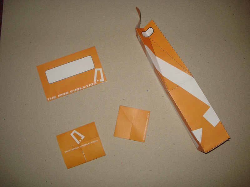
These are the four nets we were given to work with. We were told to experiment with scale, colour and layout. We were also given the option to take elements away and add elements we thought my impact on our final design. The broad range of nets meant that there was plenty of experimenting to be done.


I drew some quick 2 minute sketches for each of the four nets we'd been given so it gave me a starting point for designing my nets on illustrator which I could then possibly develop into something far better.


I cut a couple of the nets out so I could see how the logo design would work if I wanted to place it a certain way on the net which split the logo up when it was folded flat.

I re-created my logo design in photoshop as it could be so easily done with the line tool and it looked a lot neater than the hand drawn versions i'd produced. This was the original colour I thought I was going to go for, for my logo but when I tried this on the actual net on screen with the blue, the two seemed too closely related and in a sense blended into each other so this wasn't really working.

I then experimented with changing the colour of the logo to see if I could solve my problem this way but even black seemed quite harsh on the particular colour of background i'd chosen. So I came to the conclusion that the background was maybe something I needed to look into changing as even if this colour has worked, it could maybe be seen as too masculine.

I chose orange as an alternative colour for my design because I felt this colour is both masculine and feminine, its positive because its so bright and eye catching and when I consider evolution I think of things like the big bang so this also relates in a sense due to the sun and other things that were 'created' and 'evolved'. Due to the fact i'd previously recognised that black is quite a harsh colour on a coloured background I decided to experiment with white. I felt that white holds other opportunities because its going to 'change' as I print on other stocks as obviously printers don't print white. The white also makes my design look clean and contemporary which relates back to my original topic as the ipod evolution is contemporary and ipod is traditionally know for its white outer casing.


I experimented with a few different layouts until I came up with a few that I felt worked really well and would communicate to the best of their ability. I found it quite easy to place my logo on these nets due to the shape and the fact its such a simple design. It works really well on both a small and large scale because it can still be recognised.

Even in black and white this particular layout has a lot of impact with the logo because so clean and edgy. It particularly works well this large because it automatically captures attention and will create quite a sophisticated looking 'skin' for this particular piece of packaging.


I printed a few of my favourite layouts so that I could see exactly what they look like when made in something physical and see if the scales i'd printed them actually work successfully or if they need to be bigger/smaller.
These are the scales I chose with the envelope on A4, the two 'leaflet' type pieces on A4 and the bottle on A3. The scale really depended on the context I would use each of these things in for example the envelope could be a mail shot, therefor have information on the inside. This was also a chance for me to test putting the pieces together properly so I made sure everything fit.

Antique paper.
Although the antique paper looked good I felt that the fact it obviously had a slight yellow colour to it the logo didn't have as positive impact to it because it looked in a way more like a tint of the colour i'd actually printed. Due to the fact I did the stock testing on my own printer, the colour has also differed slightly but i'm actually really pleased with this result as I feel this particular colour thats come out instead also communicates 'value' because its almost gold and this could connote that the ipod evolution has great value.

Cartridge paper.
This has worked really well as the logo stands out from the background colour more and another plus side to this particular stock is that it will work across all of my packaging nets because its strong enough to be created into the bottle box shape and isn't took thick to be created into the other net shapes. The fact I can use it for all my nets mean that they can be seen as a set.

White card.
Although the white card is really good for nets such as the bottle box because its so strong, it wouldn't really work with any of my other nets as it begins to split when folded completely over and its also far too thick for the mailshot when its all folded up.

Metallic paper.
I experimented with grey, orange and white metallic paper and white was by far the best and the colours stand out because as seen above the colours get a bit lost in the darker papers which makes it quite hard to read the text on my nets. Although the colour has changed slightly again on the white metallic paper, this has also had a positive impact on what i'm trying to communicate. (see below)

Tracing paper.
I really liked the effect the tracing paper had but its just not practical for any of my nets as such because it won't last very long before it gets torn or if it gets wet it goes a little bit funny, something to consider with the mail shot. I do think the fact my logo looks almost cut out is a really good effect because its so edgy.

This is the result I got from printing on the white metallic paper. The fact the colour has changed again slightly makes for an even bigger impact because it actually looks gold on these pieces so again relates back to the idea of value. The only down side to this stock really is that its another that isn't very tolerant and when i've scored down the edges of the nets some of the edges have split which has made it look untidy.


I decided to print all of my nets on cartridge paper just because I thought this was one of the more practical stocks i'd chosen and to see if the nets really did work as a set like this. This is the more successful of the stocks because its not too thick for pieces such as the mail shot yet not too thin for the box.
I originally couldn't choose which I preferred between the metallic white stock and the cartridge paper but upon thinking about it I needed to go for practicality rather than just what looks good and the cartridge paper is definitely more practical and still has as much impact as the other stock. Realistically I would have the 'leaflet' nets and the box printed on A3 given more opportunity to print. This is however something I could take forward and experiment with in the future.
The above nets on cartridge paper were the ones I chose for my final idea and that I left out to crit. The comments I was given were...
Strengths
We like the stock.
We like the way the logo is wrapped around the bottle carrier.
It's clean and simple.
Areas for improvement
Could be double sided - something on the inside.
Some information about what it is.
Take the guides off when printing.
The logo doesn't communicate apple/music.
On one particular design the logo could be on the outside, as you can't see it when its folded.
Additional comments
Consider the colour.
Consider the position of the logo.
Could make the logo into a repeated pattern.
Could keep with the apple colours - white stock and then work with grey tints.
Experiment with silver stock.
Include ipod imagery - maybe headphones.
I felt that this feedback is really useful because it gives me so many ways I could expand on my current set of nets and so many new ideas if I was to this further. It could be definitely something to look back on. Its also brought up issues that I hadn't really though about myself.
Subscribe to:
Posts (Atom)