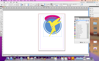
Always set the page up with at least a 3mm border to allow for bleed when it comes to printing.
You can colour a shape by clicking on it and selecting the colour you'd like.
You can also alter the colour of the outline of a shape or text by selecting the stroke.
If you click on a colour swatch you can alter its CMYK settings.
You can also create a tint of a particular colour by altering these settings.
The bottom circle is a tint of the top circle.
With this panel you can enter the pantone colour names to find them more efficiently and also select different colour books.
Preparing images.
Photoshop
- CMYK/greyscale/duotone/monotone
- 300dpi
- Create the image at the actual print size
- Format; tiff/jpeg/psd/pdf
Illustrator;
- CMYK
- Format; ai
When you place an image into indesign the pantone colours used become visible in the swatch pallet.
To see if something has a transparent background you can place a shape behind it.
When you place an image this box comes up and you can select wether or not you want the image to have a transparent background.
You can usually see the quality of an image by zooming in and looking at the edge of it.
If you take the file you are working with back into illustrator and edit it, it will automatically update to whatever changes you have made in indesign.
You can see all the properties of a design by opening it up in 'spotlight'
If you click on an image in indesign and click a colour, the design will change to this chosen colour.
If you click on 'print' and 'output' you can see the breakdown of colour a design has.
You can also see the breakdown of colour by choosing the option as seen above.
The good thing about the second option in particular is you can turn viewing of certain colours off and actually see the separation in the image.
When two shapes are overlaid, one blanks out the other, so there is an option for transparency to stop this from occurring.


No comments:
Post a Comment