Tuesday 29 March 2011

Visual language; what is a line?

Using the big sheets of techniques and ideas we all created I put ideas together of what I could base my project on. I chose my favourite three ideas which would then lead on to me choosing just one to focus on for the rest of the project. 

I chose 'use short sentences to record key events that have happened in my life' and i've linked this to the quote 'a connected series of events, actions or developments'. Above I have written my own brief of the direction I plan to take this project in, this is so that the overall outcome can be completely personal to me and should be successful due to the fact i'm following something i've written. 

We got together in partners and our partner then had to re-write the brief we had written in case we'd missed anything out and possibly to make our ideas even clearer. 

We finally wrote a timetable of what we plan to do over the next five weeks so that we can be organised and maximise our time. I plan to follow my timetable week by week so that everything gets done in good time and my work is not rushed at the end. This will also make sure I don't miss anything whilst going through my project. 

Thursday 24 March 2011

Communication is a virus; my 'no facebook' day.


There was a number of things I did instead of going on facebook, most consisted of using my time more practically with things like packing my suitcase ready to go home. Usually I would use facebook as an excuse to put packing off. The main one however, was watching the sun set. I usually spend most of my time on facebook in the evenings so I thought this was a perfect alternative. Its something that always happens but we never really take any notice of it so it was also free! which is a plus for me being a student. I found that the no facebook day was made easier by the fact I had so many other things I could do instead. 
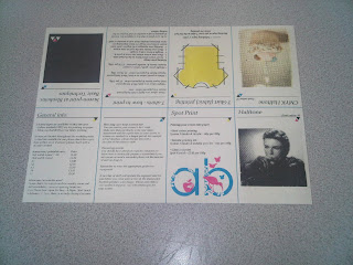
Communication is a virus; powerpoint presentation.


This is the presentation myself and Alex put together to present our idea in the final crit on Friday. 

In design workshops.

In these workshops we were taught the basics of indesign with given opportunity to revisit anything at a later date with staff if we wanted to know more about the programme. As this was the first time i've used the programme, I found it very useful. 
We began with learning how to place a picture into the programme, you could either go to the 'file' menu and select place or create a particular shape for how we wanted the image and then 'file' and place. There was also the option to fit to frame and move the image around in the frame. 


There is an option in indesign to put placeholder text in so you can gain an idea of what your spread would look like without actually having your content. 


To make the text wrap around an image like this you select 'window' and 'text wrap' and then theres various different options for wrapping the text around an image. 


In the second session we were given an article and a folder with all the objects in to recreate this article exactly how it was seen in front of us. To start with I found this process pretty frustrating but once I got the hang of it, it was actually really useful. 
To wrap the text round the phone because it was on an angle we had to first of all take away its background. This was done using photoshop and the options were to double click on the image, select the pen tool and then select 'path', 'select', 'inverse'. To wrap the text around the options were 'click circle with text symbol', 'contour options' and 'alpha channel'. 


This was as far as I got with my article because it was quite time consuming. I do however, feel that I did enough work in these sessions to progress on to my own work and create my interview page. 

Wednesday 23 March 2011

Communication is a virus; final pieces.


Here we've printed the leaflet onto different stock so that the overall finish looks better. The problem we had with the card was the fact that it didn't fold properly with it being so thick. Overall, although the colours are slightly different, I feel this is a successful outcome and communicates well. 


The posters have also been changed so that they now make more sense. They include information about what we are trying to do and the day we have set up so people will understand what face 2 face is about unlike on the previous poster design. I think these are also really successful because the layout looks really neat and considered and they now communicate a lot better. 


This is the finalised flyer design which now includes the email address so people can get in touch and let us know if they took part in our day and what they did. 

I feel overall this is a good body of work because the outcomes work well together and communicate our message in the best way possible. 


Screen print workshop; Blenheim.

After experiencing the screen printing workshop at vernon street I feel that the one at Blenheim walk is very similar. The facilities at our site are however more appropriate when it comes to printing textiles. I thought this workshop was useful because it reminded me what to do when it comes to the screen printing process and also where things can be found at Blenheim walk. The image above is a hotdog fold book that we created, the one thing I thought was really good about this is the fact it has tips and information on it and also meant we could understand screen printing to CMYK, so whilst doing the workshop and learning we were also recording what we learnt. I'll definitely be experimenting with screen printing throughout my own work. 


Communication is virus; final pieces out in the public.


This was our attempt at making our ideas go public so people could find out about the day and consider taking part. We found places that we thought they could be noticed easily and capture the attention of students. We also tried to make them fit in with the environment around them so they looked naturally placed. 


Communication is a virus; revised printed final pieces.

I printed a batch of black and white leaflets to save money and so that they could be distributed throughout the college. Although colour would have been better I feel the design comes across just as well through black and white and meant that we were making an attempt to make people aware of our 'no facebook' day. To resolve our problem of cost would could have considered screen printing them as this would have been a lot cheaper.  


This is the colour version of the flyer which we have altered slightly after the crit. We've taken into account everything that was said and made these changes. We swapped the direction of the 'face2face' logo because on previous designs it looked as though the words were facing away from each other which symbolises the opposite of our message. We also added 'the 23rd of every month' so that people are aware this would be an annual thing if they wanted to take part. I noticed that on this design the email address wasn't included so that meant people couldn't get in touch if they decided to take part in our day unless they looked at the leaflet. I amended this on the black and white copies however, before distributing them. 


The leaflet has been designed in place of the website, it does a similar job to the purpose of the website but is more appropriate as we are trying to get people away from the net. I feel the leaflet is really successful because it looks neat, is easy to interpret and fits well with the other elements we have designed. The leaflet also works well because we haven't tried to push too much information on to it so it should hopefully keep the reader more interested. It serves the same purpose as the flyer in a sense because its just trying to make people aware of what we are about. We do however, need to re-print the leaflet because the stock is a bit too thick when folded and we need to correct 'were' to 'we're'

We took the advice we were given on the posters and made a few changes. We then chose a couple of the posters to print out so that we could place them up in areas. Upon printing the posters we realised that there are still quite a few things that need to be altered about them. At the moment these designs don't state anything about the day other than the title so people will have no idea what they are all about and it makes you question the reason for the date. We need to add information about the day or simply 'go facebook free' so that they make more sense. 


Printed design boards.