
I printed a batch of black and white leaflets to save money and so that they could be distributed throughout the college. Although colour would have been better I feel the design comes across just as well through black and white and meant that we were making an attempt to make people aware of our 'no facebook' day. To resolve our problem of cost would could have considered screen printing them as this would have been a lot cheaper.


This is the colour version of the flyer which we have altered slightly after the crit. We've taken into account everything that was said and made these changes. We swapped the direction of the 'face2face' logo because on previous designs it looked as though the words were facing away from each other which symbolises the opposite of our message. We also added 'the 23rd of every month' so that people are aware this would be an annual thing if they wanted to take part. I noticed that on this design the email address wasn't included so that meant people couldn't get in touch if they decided to take part in our day unless they looked at the leaflet. I amended this on the black and white copies however, before distributing them.

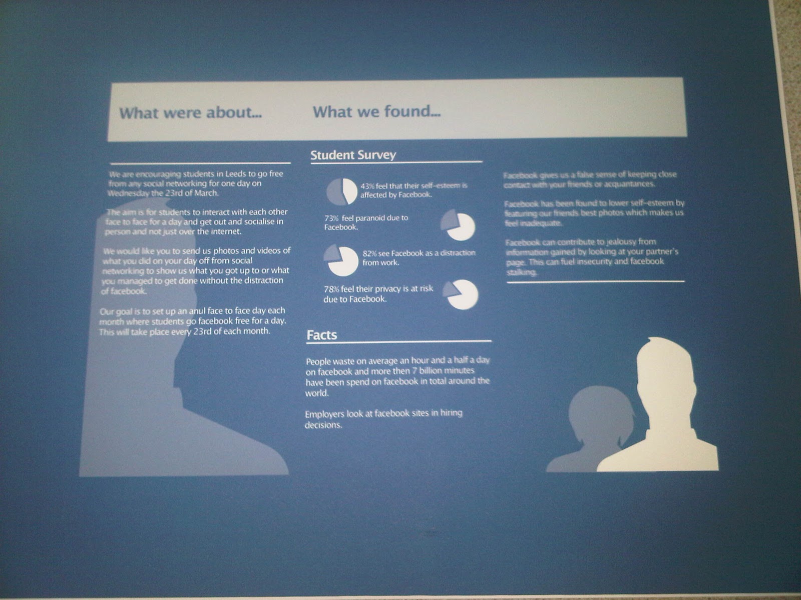
The leaflet has been designed in place of the website, it does a similar job to the purpose of the website but is more appropriate as we are trying to get people away from the net. I feel the leaflet is really successful because it looks neat, is easy to interpret and fits well with the other elements we have designed. The leaflet also works well because we haven't tried to push too much information on to it so it should hopefully keep the reader more interested. It serves the same purpose as the flyer in a sense because its just trying to make people aware of what we are about. We do however, need to re-print the leaflet because the stock is a bit too thick when folded and we need to correct 'were' to 'we're'

We took the advice we were given on the posters and made a few changes. We then chose a couple of the posters to print out so that we could place them up in areas. Upon printing the posters we realised that there are still quite a few things that need to be altered about them. At the moment these designs don't state anything about the day other than the title so people will have no idea what they are all about and it makes you question the reason for the date. We need to add information about the day or simply 'go facebook free' so that they make more sense.


Printed design boards.
No comments:
Post a Comment