
To start with a created a grid so I knew exactly where I was going to place things and this was also something i'd learnt in a visual language session with Lorenzo. I worked on the text first as I felt this was most important and once I knew where this was going I could place in my images. I did quite a few layouts trying to get the placing of my text correct.


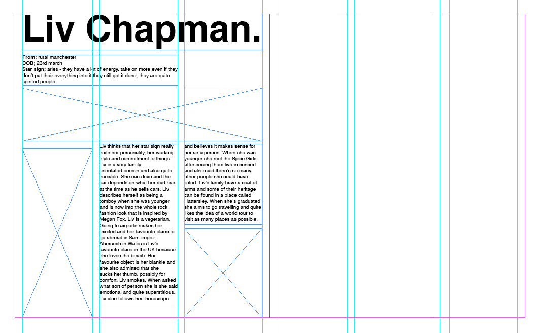
Here i've shown initially where I thought my images would go (the crossed boxes) as I though at the time I was satisfied with this layout.

I didn't like this at all because the text on the right hand side just didn't sit right as the whole thing was out of balance.

I was really happy with this layout, I though where I've placed all the text works really well and doesnt look out of proportion. I could then move on to experimenting with colour.

In Liv's interview she said that she liked the whole rock chick style so I felt that pink and black where suitable, as well as pink being one of her favourite colours.

However pink on its own seemed to work a lot better and looked neater.

Although the pink background looked quite good I felt it was way too overpowering and due to there being such a big block of colour the white text got a bit lost in it.

Instead I put a block of pink behind the text to emphasise the fact the article was about Liv Chapman.


This is the final layout for text and colour that I was pretty happy with because it look sophisticated. I stuck with a san serif font (helvetica) as Liv had told me she likes this font and it seemed to be working.

My illustrations were hand drawn and I drew them on to a copy of the layout so I could see exactly how it would look and know I was happy with it. My illustrations are quite random as Liv stated this as a personality trait.

I took all my hand drawn images into photoshop to digitise them and then added them to my layout where i'd placed them on the hand drawn copy. At this stage we had a mini crit in groups, in one of Lorenzo's type and grid sessions, my comments were mainly related to typo's and the fact that the section of 'likes' could be moved across as well as the title, as they get too lost in the border.


This is the final layout for my indesign project. I feel its successful because theres balance on either side and the page looks full and exciting. The colours work really well together but aren't too overpowering. I feel that I did take some aspects of what we learnt with Lorenzo into this brief in terms of how my imagery is placed. The border looks quite good because it frames my layout. If I were to do this brief again I could however, be a little bit more experimental with the whole layout in general.
No comments:
Post a Comment