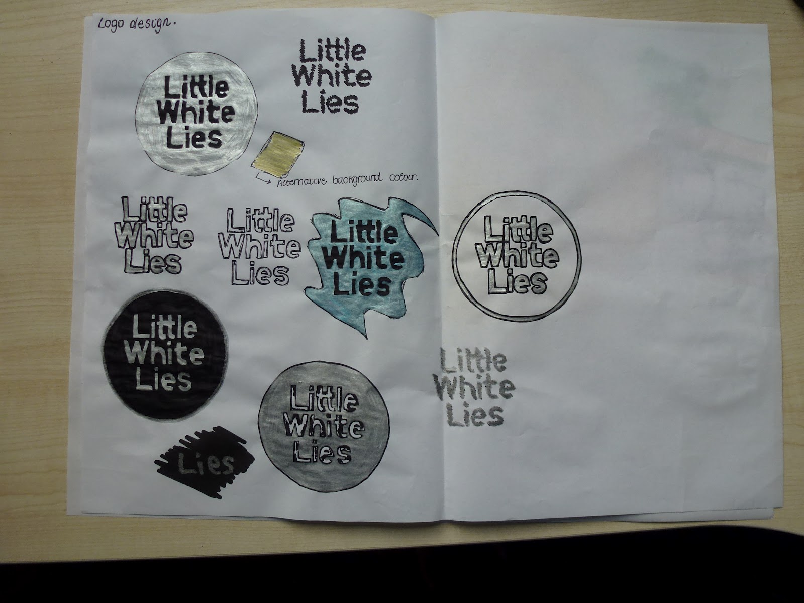
When I discussed the fact I wanted my magazine to be limited edition within the crit it was suggested that I try silvers and golds as a colour scheme for my rectified logo as this has the limited edition effect. I decided to stick with the original circle shape because this is something the audience may look for when they go to buy the magazine, it gives it identity. I felt silver was working better automatically because sometimes gold can look a bit tacky when in certain contexts. I did try taking the circle away just to see what the logo would look like but the impact just isn't the same.

Out of all the logos i've designed, I feel this works best because it's not far from the original but has that limited edition touch I'd like all the magazine covers to have. It also means that the other information such as the issue, price, date, barcode etc can be applied really easily as they are usually black on a white background anyway. I'm yet to decide whether to print a digital copy and add the silver or whether this hand rendered look I have above works best. Hand rendered might work best with the illustrations being hand drawn too but I think i'll have to put them together to see properly.


From feedback given in a crit I decided to stick with the exisiting shape of the Little White Lies logo because someone made the point that people may recognise the magazine through this logo as it's right at the top so may be the first thing you'd see. I scanned the silver logo (above) in and edited in photoshop until I was happy with the thickness of the line around the circle and text. I've decided to keep this hand rendered look from my experimentation sheet because it's in keeping with the direction I want my illustrations to take. I took my own copy of Little White Lies magazine to see what needed to be added to the plain logo in order for it to be sold. I went for a slightly different font for the information around the text of the logo but this still works well because its in keeping with the hand drawn asthetic. I've also decided to place the barcode at the bottom instead of top because I feel this layout looks a lot more ordered and the barcode doesn't over power the logo itself. I then decided to create a plain logo as well that could be used over any other pieces I design due to the fact i've decided to make the logo silver. I feel that this should now be applied to everything because it is something that highlights the quality of the pieces and limited edition. The checked area shows which parts will be silver.
There isn't much logo development because I was already working with the existing one and didn't want to change too much about it, so it was pretty straight forward.
No comments:
Post a Comment