


The images above show the different in quality between the ipod that I had hand drawn and the ipod I created on the mac. I feel that the vector image works a lot better because it looks neater but still has this 'hand drawn' quality with the stroke used so it's still quite quirky. I've also experimented with the design of the outer casing of the ipod and feel these edgy shapes work really well because they link to 80's design along with the bright colour. When I asked for the opinion on which looked better someone said that they preferred the hint of colour and white because this was still quite uniform to apple with the clean, crisp design.

I then began looking at the layout for my posters by creating nine ipods in the same colours as current ipods can be bought such as the nano, again working to apples existing products. Using a range of colour I felt would make the ipod more marketable because consumers like to have options. The decision to choose multiple colours also benefits the overall design because I want to keep the background quite plain so it's crisp, clean design, so the ipods bring colour in quite well.


Once I was happy with the ipod design I began experimenting with the layout of my posters, I feel that because the background is going to be quite plain, the composition is quite important because this is what is going to make it visually interesting as well as the imagery. I also started looking at the logo I need to create to brand the ipod, keeping the original ipod text will make the product more so recognisable and then above I chose a font I thought was maybe a bit 'retro' looking. Although I really liked this font I felt that the 'r' looked more like a 'h' which made the word harder to read.


I then found this font which I felt worked a whole lot better because its really easy to read and still has this 'retro' feel to it because it reminds me of an old school digital font. Keeping the ipod and the retro as two different fonts works quite successfully due to the recognition of the ipod font being linked to Apple. I've also included the Apple logo on this last design so I could see more how the layout could come together, I feel using the black logo works quite well because it's crisp and keeps in theme with the simplistic design.


I feel that some of my first layout designs above are working quite well so far by having the ipods on different angles and going slightly off the page because the compositions are visually interesting and they make most of the space given in the layout. Due to the fact I am creating a series of three posters I actually think that some of these could be seen as a series but because these are initial ideas they could be worked on. There is also other information I am yet to add to these posters in terms of advertising the launch of the ipod so I will need to experiment and see how this works with what is already on the page.


The two orange ipod ideas above were something I tried because I felt maybe the first ideas were looking a bit too similar. By using similar ideas as the other poster designs I would say that these designs still could link as a series in terms of the positive and negative space. These designs work quite well because having the ipod so big really puts it out there to capture the attention of the intended audience.

I then went back to looking at more uniform ideas for the layout but I feel that this doesn't communicate the idea that ipods are fun and out there, it looks a bit too 'sensible'.

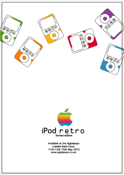
When I figured out a suitable context for my iPod to be launched in (the Appleexpo) I decided to add the relevant information to my posters so I could see how this would effect some of the layouts i'd previously tried. Keeping this information together like I have done will be a lot more successful because it keeps the whole design looking more simplistic and is likely to be easier on the eye. This was also the point in which it was suggested that I just use the colours from the multi-coloured retro looking Apple logo, again opting for simplistic design. I feel getting rid of some of the other colours benefits the design because it means i'm not trying to cram so much design into one poster.


Originally i'd been working with the plain black logo but another suggestion was that I actually use the retro looking logo because it fits in with the colour scheme of the iPods, both design decisions that crossed over. This works really well in particular because it fits with the theme of my design being retro and brightens the design up a little bit.


I also began to consider the information about the actual ipod that I should include on the poster, here being the memory size and playback times. Although I think this is very important information, I don't think the audience will pay enough attention to read such details.

I could however simplify this information and make the fact the iPod has a large memory a desirable element to the product.

Here I looked back at the idea of using one ipod but including all the colours of the different iPods. I don't feel as though this would be very effective because you don't see the full product and people may get the wrong idea and think this is actually a multi-coloured product so in a sense it would be false advertising.


After i'd decided I was happy with the information I am going to include on my posters, I experimented a bit more with the actual layout and placing of the product. I've kept the idea of having a lot of white space because I feel this looks a lot more free and creates pretty sharp design. I think the designs that have the smaller ipods work better because they aren't too overpowering but big enough to be able to understand what the product is. On these designs nearer the end I have tried to keep the colour scheme the Apple logo uses to give order to the way in which my ipods appear on the page. I do have some favourites within the layouts I have created so it's now a matter of looking back through the designs and choosing the ones I feel work best as a series.
No comments:
Post a Comment