Once I scanned the original hand rendered drawings in, I took them into illustrator and vectored them all so there would be a continous style throughout the illustration for this project. I felt this style would be beneficial for the project because I knew already that I wanted the designs to be really bold and quite cartoony, as well as simplistic as possible so it communicated to a range of target audiences.


Once I vectored the bow illustration I could decide where best to have the label and what size this would be so I moved it around a bit. The bow won't nescessarily be blue, I just changed the colour for the purpose of these screenshots so I could see how the complete design would look. I think the top left design works best because it's not too overpowering and the whole design is quite balanced.


I then moved onto vectoring the present illustration. Initially I didn't know whether to have the crisscross part of the design with the black outline but think this definitely works better because without it looks a bit lost in the actual square colour.


I then experimented with a few different colours and thought about having two different presents in the design so one targeted the male audience and one the female audience. I've gone for pretty bold colours as i'd like the design to stand out too.

To bring more depth to the image i've made the inside of the bow slightly darker so it almost looks 3D.


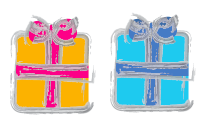
Testing more colours for the present design
I think using purple is too close to the blue so both designs come across as really dark instead of this bright bold look I was going for. The detail is lost in the black line too and I think this is something that's going to link all of my imagery together.

These colours and this way round definitely works really well because the two objects aren't going to merge into one another once put into a design and they have very defined target audiences. (Need to make sure I make the insides of the bow darker on the orange present!) The detail is also clear in the black line so it works better all round.

Here I was trying to decide whether to use the white Coca-Cola logo or the red one because theres so much colour already within the actual imagery. I don't think I can actually tell just by looking at it like this so I will definitely have to apply this at the bottle design stage instead.

I then had a moment where I thought the presents looked quite plain so how could I enhance the design. I decided I would try altering the vector line around the presents but this really doesn't look good. It doesn't really make the imagery look inviting like it should be.

Just to be sure I applied it to an actual character too but this looks really weird and doesn't look like rudolph at all!

You can make this effect look a bit softer but I still feel it's taking it away from the original imagery too much so i'll definitely steer clear of this.

There's then the option to take the black lines away completely but when applied to a background how will this look? The colours might blend into the background. Black line seems to be the best route to go down because it brings out the detail in the imagery and it very true to my own drawing style and material.
No comments:
Post a Comment