Imagery for the book cover and promotional material.
My research informed me that the book would be most recognisable through the use of the main characters so I had to consider how I could put my own person twist on this. I began by drawing each of the characters and the willow tree freehand so that it could be then scanned in and altered digitally. I've tried to keep a similar style running throughout these drawings so that they will all work together once I get to the book cover layout stage.
I decided to vector two of my images as a starting point in case I decided I didn't like this style. When doing so I experimented with having an outline and not having one. Although without creates a soft easy going image, I feel that with an outline is more true to my personal drawing style and also makes the characters stand out which is really important for the book cover.
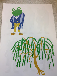
I printed the sheet on the left out with the vector examples on just to see what the colours would look like. I found that the frog may be a little too dark so then went through and altered the colour numerous times so that I could also choose from a variety. This is something i'm going to do throughout this brief and my others with the main focus being design for print.
Although I liked how the vector image looked I still felt there could be more done to experiment so Beth suggested trying a watercolour background behind my images as I had mentioned conidering doing my imagery in watercolour by hand. I think this works so effectively and probably more so than it would by hand because the image is still really crisp.
When I cut the background away this is the result I got. I think this is definitely a style i'm going to take forward because it makes the images more unique and again, true to my personal design style. It gives them a bit of depth and it looks overall more interesting. I just need to decide which colour watercolour background would work best so will create some of my own.
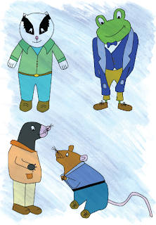
Before experimenting with this watercolour background idea I created the other three characters in illustrator so that I could place them all on a coloured background. I haven't really experimented with the colour of the characters/clothing but don't feel I need to at this stage unless they look too dark when it comes to printing them. I feel the colours used compliment each other well and will work together well on the book cover.
I placed the characters onto different watercolour backgrounds that i've create myself and feel that the colour of the characters determines which background actually works well and they don't all work on the same background because it makes the colours look a bit odd.
The characters above work well on these two backgrounds because of the colours used in the vector.
This is the comparison of the original/plain vector image and that with the background behind it. The background definitely works best because it makes the imagery have depth and just appear overall more interesting.
(Closer view of images with background)
I also noticed that the characters on the orange background had the background going from top to bottom rather than diagonally on the other characters. This doesn't look quite as good so I feel this needs to be changed.
This is the refined design with the background diagonally and works much better because it fits with the other imagery.
These are the final character designs that i'm going to take forward for my book cover and promotional material. Although i'd slightly misjudged how time consuming this would be, I feel this is the most nescesary part of the brief over with as the imagery is the main focus of all the material. The great thing about these characters is they suit the target audience of children because they are fun, brightly coloured and the general style communicates well.


No comments:
Post a Comment