Once all elements of the bookcover had been decided including the layout, the rest of the products were going to be really easy to create because obviously the same colours would be used an similar layout considerations too. I chose to come up with three different designs for my bookmarks because it gives the consumer options but not so many that they feel overwhelmed, it also means that my designs aren't forced and the three I come up with should be well considered.


I initially began with a really simple design with just the tree because at this point I had the idea that I could take different elements from the book cover and apply them across the bookmarks. I considered getting rid of the opacity that I had applied on the bookcover but still feel this opacity is a really strong feature and makes this design link back to the bookcover.

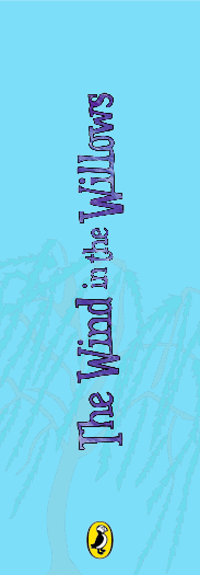

I tried to experiment with the text having a slightly different layout but being on it's side like this doesn't communicate as well because it doesn't read as easy. To keep things really simple I then decided upon a final layout for the first bookmark and used this layout to the consider the second one. I added all the characters in and although they appear really small here the whole design balances out because of having the tree in the middle and the title right at the top.


I then experimented with where I could have the puffin logo because I liked the way everything else was placed. The great thing about this logo is that because its on a yellow background it can be applied almost anywhere and still stand out. It can also be recognised via the colours so doesn't have to be particularly large.


These are two of the final designs for the bookmark with the other layout above also been the third. They are quite simplistic which works really well and give the consumer a choice of designs both exciting and bold to the more simplistic design with just the tree.
No comments:
Post a Comment