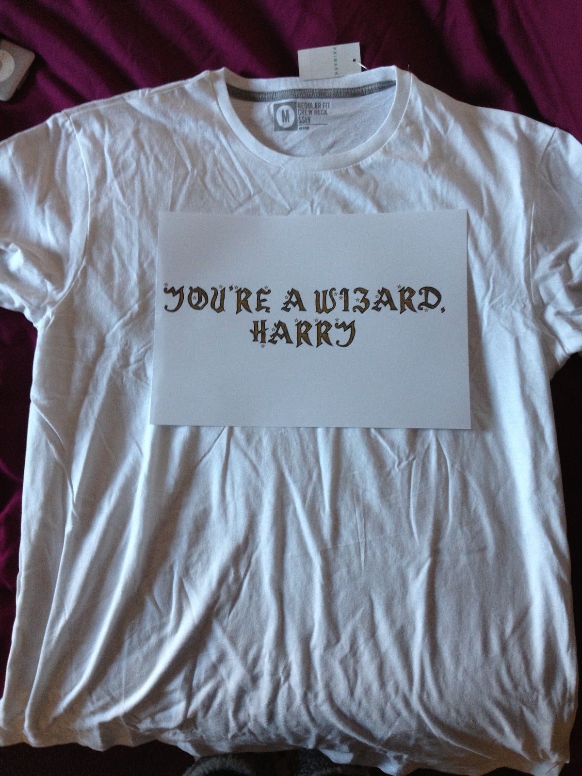


I'm using a t-shirt transfer to make my t-shirt design properly and thought once I'd printed this out I would experiment with the layout of this design by moving the actual print out around the t-shirt so I could see more realistically the scale of the t-shirt to design and more so how it would look in real life when ironed on. At this point I realised I'd made a really stupid mistake, i'd forgotten to reflect the t-shirt design so that when I ironed it on it can be read properly because if it was like it is currently in these images it would be backwards! I think having the design more toward the top of the t-shirt and in the middle is definitely most effective because with it being text it obviously needs to be read and the easier it is to read, the more likely to consumer is to purchase the product. I've also seen on a lot of other t-shirt designs that text tends to be horizontal and placed where it's easiest to read.


This is what the design looks like once i'd ironed it on to the t-shirt. It hasn't come out perfectly but this is both a good and a bad thing because round the edge there seems to be a bit of a mucky line and within the letters some of the brown didn't transfer. The good thing is that the t-shirt is for photographic purposes only and the fact the letters didn't come out perfectly because this gives the design a bit more depth and character and works well with the style. The bad thing is this mucky line but it's not a huge problem. In future when creating t-shirts and looking for the highest quality I will definitely either order them off the internet already printed or use the heatpress in screen print instead of my iron.
No comments:
Post a Comment